Post by Natalia Vodianova on Nov 12, 2012 9:12:49 GMT -5
Hello Models!!!
Welcome to your Third Judging Session. This week, Jared couldn't be with us since he has a computer issue but lucky for us, we have Gwen to join us for the first time and she's going to help me this week to judge and rank your photo.
Let's start the judging

Gwen: I love most of this photo. I love the rock look (just as a rule of thumb and not just in this case alone) and you pull it off well. The setting is unusual, but I like that it's unexpected. You definitely embody the vibe that I believe this magazine shoots for, so that's a nice addition, too. Why I say that I love most of the photo and not just saying that I love the photo, I'm not completely sold on the angle of your head. While I don't necessarily want it to be upright, I think the angle is a little too severe for my taste in this shot. However, that's just a very small complaint in an otherwise great shoot this week.
Natalia: I love the setting. You make laundry so fashionable. For me this is your best shot. You're more comfortable in your photo. The angle is much better. And your styling too is great

Gwen: Ok, I want to start by saying that I'm upset I missed your Spiderman shot last week. Very sexy. Anyway, I really like your cover this week. It's a great shot of you and the filter adds a nice artistic quality to it. I appreciate your description because I wasn't sure at first if VMan was the off-shoot of V. Now that I know it is, I have much more familiarity with the style of the magazine you are posing for and the vibe you are giving in the shot definitely fits the brand. Good shot this week.
Natalia: Great job. I always love the cover from the V magazine. I think it's very autistic. I love the way the color of the logo stand out. I definitely see a model in this photo. Great job, Andrew.

Gwen: It's a nice shot and you are right: Bradley Cooper does have some amazing eyes that are well-showcased here. The style fits the brand and everything, but I am left wanting just a bit more. While it's a nice shot, I feel like there could have been room for more impact with this photo. However, you knew what you wanted to show with this shot and you did just that. Mission accomplished.
Natalia: I like the styling. I think it's very smart and stylish but the cover for me is too crowded with lot of words so it distract my focus on you this week. But I just realized that your eyes are so beautiful.

Gwen: This cover is from the same shoot as your Sexy picture and reusing pictures from the same shoot tends to be frowned upon in this series. I realize that this is the only magazine cover of your model (I did a quick search so I would know whether to really hold weight to the "reusing shoot" thing or not), so maybe trying to create a magazine cover would have been the route to go. That said, I'm also not a huge fan of this particular shot. The pose seems a bit awkward to me. On the bright side, at least the shot is interesting. Even if I'm not sold on the whole outcome of it, at least there are things to look at here and be discovered. That definitely wins you points with me.
Natalia: Another cover from Troix. I never heard about this magazine until last season from Tyler and so far I like every cover from that magazine. You look so hot in this photo. My only concern is you submit similar photo from last week photoshoot.

Gwen: This is a CD cover? This week was supposed to be a Magazine cover or Magazine spread. I will have to wait for a judgement call from the host when it comes to my ranking this week. If she thinks it's acceptable, then I will ignore the fact that it's a CD cover and rank it based off of the merits of the picture. If she decides that it doesn't work because it was supposed to be a Magazine cover, then that will be reflected in my rankings, too.
As for the picture itself, I like it. It's a simple, clean shot, but you look very fashionable in it and while I'm not familiar with your style of music, I do feel like I'd know your genre just by looking at this. It's also very commercial, which was what you were shooting for.
Natalia: I don't know where did you get the idea that you can submit the CD photo. It's going to affect your ranking this week for me even though I really like the photo. You should pm me first and ask whether you can use the photo or not. I only can accept Magazine Cover, Magazine Spread, Own Created Magazine Cover and Advertisement from Magazine

Gwen: I read the text of the spread and it leaves me to believe that the little girl is your daughter. It's nice to have her in the picture with you and helps give you more warmth and makes you a more relatable person. I'm a little disappointed that in this shot, you're standing and smiling at the camera when your previous shot was standing and smiling at the camera, too. Also, I generally don't like when people use spreads when they have covers available, but I did a search for your magazine covers and in this case, you were right to go with this spread over those covers. It's a nice shot of you and definitely works for this round. I just want to leave you saying to be conscientious of the pictures you select in future rounds. Make sure that you have varying looks and poses. Two similar poses in a row isn't really going to hurt you, but I do want to say something before it possibly becomes "three times in a row" so that you won't get docked for something we didn't tell you not to do. In the end, good job this week.
Natalia: I like the concept but I don't know if this photo going to help you this week. The spread is too small. But I do love the relationship that you trying to portray in this photo.

Gwen: I love the top 80% of this photo. You're very well-groomed and the suit looks great on you. It also its what I would imagine the style of the magazine to be. Below your blazer button, it gets a little messy, so that's why I say I love the top 80%. You have striking eyes that show well here and I love the way your hair is styled. It's a little plain in terms of posing, but it still works. It could just be that you're just the gorgeous, but despite the posing being a bit plain, I'm not at all bored. Great shot.
Natalia: I think the cover look so exclusive and classy but at the same time I think it's a little bit boring. I actually want to see the fun side of you more. I know you can do it better than this. Overall, I still like it

This is the third week and the fourth shot we've seen from you and all four shots have had the exact same angle: you directly facing the camera. In the future, I'd like to see you utilize more angles for your model to show more sides of you. That said, this shot works. I like the placement of your right hand. It may be a little subtle, but that action brings more movement into the photo, so things don't look so static, as can happen quite often in these plain shots. The look suits you, too. It's a nice cover and I'm sure you'll be fine with week (with me, at least). I just want to reiterate that I'd like to see different angles from you in the future.
Natalia: Yeah you need to give us variety next time. I really like the styling of this photo. It's geeky but in a sexy way. Your face expression is much better than last week. Overall, I love it but remember, variety!!!

Gwen: This photo definitely has a bit of a quirky vibe to it. I can't tell if I love it or if I hate it. I keep going back and forth between the two. If nothing else, at least it's able to illicit some sort of feeling from me, which either way, is better than apathy towards a shot. I like the retro feel of your attire in this shot and I think that works very well with the magazine you are posing for. The pose is what's mainly giving me a mixed reaction. I like that it's different, but I'm also not quite sure I fully like it for Esquire. I would imagine you in a more powerful (yet still classy) pose would have fit better, but that's just my personal taste. Otherwise, very good picture this week.
Natalia: My only issue with you this week is your neck. Other than that, I love this photo so much Nicholas!!! A lot of models wear the suit for this week photoshoot but you stand you out the most for me. I love the styling. The cover is so quirky and fun. Great job!!!
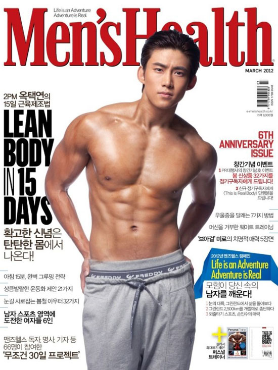
Gwen: Well, you're definitely showing off a good amount of muscle in this cover. You look like you're judging me, though. I think I might have to make a quick trip to the gym after this to alleviate my newfound self-consciousness. The style is typical of a Men's Fitness magazine and with that particular brand, there's not really much one can do to distinguish themselves when it comes to the styling. That makes the pose all that much more important for you this week. The pose is definitely different. I'm happy to see that it's not some pose we'd find on 20 different copies of the magazine in the past year alone. It's different, but still shows you off in a nice way.
Natalia: This is sexy!!! Like I told you last week, don't afraid to flaunt it. I love your expression. Your body is .... I don't know the exact word to define your body... Great job!!!
Welcome to your Third Judging Session. This week, Jared couldn't be with us since he has a computer issue but lucky for us, we have Gwen to join us for the first time and she's going to help me this week to judge and rank your photo.
Let's start the judging

Gwen: I love most of this photo. I love the rock look (just as a rule of thumb and not just in this case alone) and you pull it off well. The setting is unusual, but I like that it's unexpected. You definitely embody the vibe that I believe this magazine shoots for, so that's a nice addition, too. Why I say that I love most of the photo and not just saying that I love the photo, I'm not completely sold on the angle of your head. While I don't necessarily want it to be upright, I think the angle is a little too severe for my taste in this shot. However, that's just a very small complaint in an otherwise great shoot this week.
Natalia: I love the setting. You make laundry so fashionable. For me this is your best shot. You're more comfortable in your photo. The angle is much better. And your styling too is great

Gwen: Ok, I want to start by saying that I'm upset I missed your Spiderman shot last week. Very sexy.
 Anyway, I really like your cover this week. It's a great shot of you and the filter adds a nice artistic quality to it. I appreciate your description because I wasn't sure at first if VMan was the off-shoot of V. Now that I know it is, I have much more familiarity with the style of the magazine you are posing for and the vibe you are giving in the shot definitely fits the brand. Good shot this week.
 Natalia: Great job. I always love the cover from the V magazine. I think it's very autistic. I love the way the color of the logo stand out. I definitely see a model in this photo. Great job, Andrew.

Gwen: It's a nice shot and you are right: Bradley Cooper does have some amazing eyes that are well-showcased here. The style fits the brand and everything, but I am left wanting just a bit more. While it's a nice shot, I feel like there could have been room for more impact with this photo. However, you knew what you wanted to show with this shot and you did just that. Mission accomplished.
Natalia: I like the styling. I think it's very smart and stylish but the cover for me is too crowded with lot of words so it distract my focus on you this week. But I just realized that your eyes are so beautiful.

Gwen: This cover is from the same shoot as your Sexy picture and reusing pictures from the same shoot tends to be frowned upon in this series. I realize that this is the only magazine cover of your model (I did a quick search so I would know whether to really hold weight to the "reusing shoot" thing or not), so maybe trying to create a magazine cover would have been the route to go. That said, I'm also not a huge fan of this particular shot. The pose seems a bit awkward to me. On the bright side, at least the shot is interesting. Even if I'm not sold on the whole outcome of it, at least there are things to look at here and be discovered. That definitely wins you points with me.
Natalia: Another cover from Troix. I never heard about this magazine until last season from Tyler and so far I like every cover from that magazine. You look so hot in this photo. My only concern is you submit similar photo from last week photoshoot.

Gwen: This is a CD cover? This week was supposed to be a Magazine cover or Magazine spread. I will have to wait for a judgement call from the host when it comes to my ranking this week. If she thinks it's acceptable, then I will ignore the fact that it's a CD cover and rank it based off of the merits of the picture. If she decides that it doesn't work because it was supposed to be a Magazine cover, then that will be reflected in my rankings, too.
As for the picture itself, I like it. It's a simple, clean shot, but you look very fashionable in it and while I'm not familiar with your style of music, I do feel like I'd know your genre just by looking at this. It's also very commercial, which was what you were shooting for.
Natalia: I don't know where did you get the idea that you can submit the CD photo. It's going to affect your ranking this week for me even though I really like the photo. You should pm me first and ask whether you can use the photo or not. I only can accept Magazine Cover, Magazine Spread, Own Created Magazine Cover and Advertisement from Magazine

Gwen: I read the text of the spread and it leaves me to believe that the little girl is your daughter. It's nice to have her in the picture with you and helps give you more warmth and makes you a more relatable person. I'm a little disappointed that in this shot, you're standing and smiling at the camera when your previous shot was standing and smiling at the camera, too. Also, I generally don't like when people use spreads when they have covers available, but I did a search for your magazine covers and in this case, you were right to go with this spread over those covers. It's a nice shot of you and definitely works for this round. I just want to leave you saying to be conscientious of the pictures you select in future rounds. Make sure that you have varying looks and poses. Two similar poses in a row isn't really going to hurt you, but I do want to say something before it possibly becomes "three times in a row" so that you won't get docked for something we didn't tell you not to do. In the end, good job this week.
Natalia: I like the concept but I don't know if this photo going to help you this week. The spread is too small. But I do love the relationship that you trying to portray in this photo.

Gwen: I love the top 80% of this photo. You're very well-groomed and the suit looks great on you. It also its what I would imagine the style of the magazine to be. Below your blazer button, it gets a little messy, so that's why I say I love the top 80%. You have striking eyes that show well here and I love the way your hair is styled. It's a little plain in terms of posing, but it still works. It could just be that you're just the gorgeous, but despite the posing being a bit plain, I'm not at all bored. Great shot.
Natalia: I think the cover look so exclusive and classy but at the same time I think it's a little bit boring. I actually want to see the fun side of you more. I know you can do it better than this. Overall, I still like it

This is the third week and the fourth shot we've seen from you and all four shots have had the exact same angle: you directly facing the camera. In the future, I'd like to see you utilize more angles for your model to show more sides of you. That said, this shot works. I like the placement of your right hand. It may be a little subtle, but that action brings more movement into the photo, so things don't look so static, as can happen quite often in these plain shots. The look suits you, too. It's a nice cover and I'm sure you'll be fine with week (with me, at least). I just want to reiterate that I'd like to see different angles from you in the future.
Natalia: Yeah you need to give us variety next time. I really like the styling of this photo. It's geeky but in a sexy way. Your face expression is much better than last week. Overall, I love it but remember, variety!!!

Gwen: This photo definitely has a bit of a quirky vibe to it. I can't tell if I love it or if I hate it. I keep going back and forth between the two. If nothing else, at least it's able to illicit some sort of feeling from me, which either way, is better than apathy towards a shot. I like the retro feel of your attire in this shot and I think that works very well with the magazine you are posing for. The pose is what's mainly giving me a mixed reaction. I like that it's different, but I'm also not quite sure I fully like it for Esquire. I would imagine you in a more powerful (yet still classy) pose would have fit better, but that's just my personal taste. Otherwise, very good picture this week.
Natalia: My only issue with you this week is your neck. Other than that, I love this photo so much Nicholas!!! A lot of models wear the suit for this week photoshoot but you stand you out the most for me. I love the styling. The cover is so quirky and fun. Great job!!!

Gwen: Well, you're definitely showing off a good amount of muscle in this cover. You look like you're judging me, though. I think I might have to make a quick trip to the gym after this to alleviate my newfound self-consciousness. The style is typical of a Men's Fitness magazine and with that particular brand, there's not really much one can do to distinguish themselves when it comes to the styling. That makes the pose all that much more important for you this week. The pose is definitely different. I'm happy to see that it's not some pose we'd find on 20 different copies of the magazine in the past year alone. It's different, but still shows you off in a nice way.
Natalia: This is sexy!!! Like I told you last week, don't afraid to flaunt it. I love your expression. Your body is .... I don't know the exact word to define your body... Great job!!!

