Post by Natalia Vodianova on Nov 5, 2012 23:45:51 GMT -5
Hello Models!!!
Welcome to your first judging & elimination.
This week you need to submit not one but two photos according to the themes given which is Smile & Black & White. I think everyone nailed the Black & White theme but for the Smile, we were not really impressed.
Let's start the judging session now


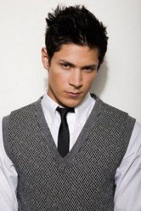
Natalia: I'm not a big fan of your smile photo. It is too cheesy and I don't think you have an attractive smile here. As for you Black & White, I think it's over-the-top but it work well because we're looking for something edgy and unique.
Jared: I don't mind the smile but it's not my favourite. I agree it's a bit cheesy. I love the B&W, it's creative and powerful. Yes it's over the top, but you're over the top so this works for this theme. I do like the contrast between the two photos as you look absolutely mean in the B&W.
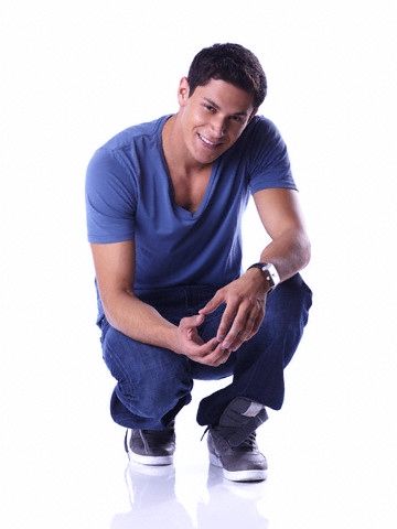
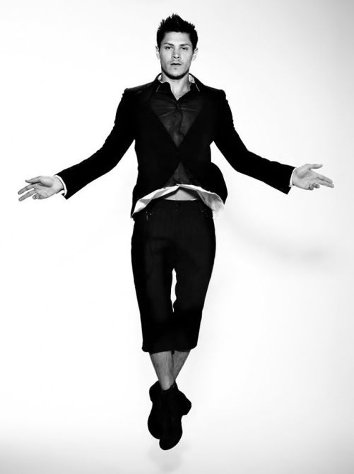
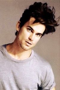
Natalia: I think you have a cute smile but I'm not so sure about your pose. I rather to see you stand up. I love your B&W photo. You bring the energy into the photo. The styling is great. Overall, decent photos
Jared: I like your smile but for a smile shoot, you really should just submit a headshot, something that focuses on just your face so we can see that smile clearly. I like your B&W photo. I like the action in and how you don't look forced. I'm not loving your expression, but it's ok, it's minor. The rest is great.


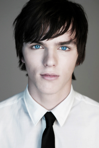
Natalia: I really like both photos. You look so commercial for the smile shot. I like the setting. The styling is great while for your B&W I love how simple it is. I feel the connection and I think there's a story behind this photo.
Jared: Like with Alex, more of a headshot would be great for the smile, but it works here because of the pose. And that you're pulling your jacket up so you're pulling my eyes up. I like the contrast between commercial and editorial. Your B&W seems more editorial. I like your expression and the angles. I think you look a bit like Milo V.


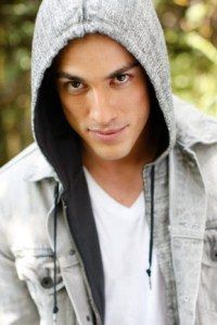
Natalia: I love the smile photo so much. I think the smile is very natural and I like your style too. I don't think your B&W photo is strong as your smile one because I think it's a little bit too boring but overall, I think you did good this week
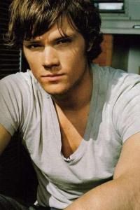
Jared: I like the smile in your avatar more but I love your appearance in your submission. I really like your messy hair. I love the carefree attitude you talk about and it doesn't look forced. I disagree with the gorgeous Natalia about your B&W though. I love it. Your pose is on the boring side but the setting works with the pose but your face is strong!!! Your eyes are powerful and in a B&W, that's great work.


Natalia: I love your styling for both photos. Your have a cute smile. I think you look so commercial. As for your B&W, you need to work more on your expression. I still see the cuteness even though you try to look serious here. But overall, I'm impressed with your photos, Stiles
Jared: I'm going to say right now that I really like your smile. I know how hard it is to find a full smiling picture sometimes that works for these games so I feel for you if anyone complains. You look young and fresh and I like it a lot. Then we move over to the B&W where you look older, fiercer. I love the contrast and I love that you threw some action into the shot to make it more. I really think you did a great job.


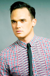
Natalia: I'm not sure about your smile photo. I think the angle isn't great cause your forehead look so wide here. And the smile doesn't look good and natural but I love your B&W. Very simple but sophisticated. The angle works here and you look so yummy here.
Jared: I don't like your smile photo, i'm very sorry. Your teeth aren't nice and the smile looks forced and I agree about the forehead. Your B&W on the other hand...........amazing. I would never guess these were the same guy. I love the hair, the pose, the expression. You are working this and you're working it well.


Natalia: I like both photos. You have a beautiful smile in the first photo but I think it would be so much better if the photo isn't from the red carpet. But it's still a lovely photo. You look so pure and innocent in your second shot. I like it but I think you can work more on your angle but overall, you did a lovely job for the first week
Jared: I'm not a fan of candids being used for photo shoots but I know how hard it can be to find good smiling photo shoots. It's not bad though it's not great. You have a great smile. Your B&W? YOWZA!!! Look at that arm!!! I love muscles that don't look gross but are huge <3 Very nice.


Jared: Oh Matt, I do not like your smile photo. It looks fake overboard. I'm going to move right on to your B&W because this, this is amazing!!! The cards flying around give it that extra something but your face is so beyond gorgeous!!! You pulled it off that's for sure!!
Natalia: I agree with Jared. Your smile photo is not as good as your B&W. I think the angle is wrong and the smile itself feel so unnatural. Meanwhile, I love your B&W photo so much. I love the attitude and your face expression here. Good job


Natalia: You have so much energy in your photos. But you still look so hot especially in the smile shot. Same as Justin, next time try to find the photo from the photoshoot instead of the red carpet appearance. I'm not sure about the scream in your B&W. But it's unique and different from the other models
Jared: Like I told Justin, candids are not the best for this shoot, but again, I understand. What works for you is that your smile is gorgeous and you're so damn sexy. For your B&W, it's different, it's edgy, it's...........Dennis Hopper!!!!!!!! I wasn't sure how I felt the first time I saw this photo, but now it's growing on me. Good job.


Natalia: It's interesting for you to come up with two B&W photo but I do see the contrast in both photos. I like your smile but I think you need to control it a little bit. I love your B&W. I can see the fashion value in this photo. Overall, good job
Jared: That little peek of the tongue between your teeth give this photo an extra edge. Bravo there. I like it. Your B&W is cute. I like the white flowers in there to contrast all the black. It's different and edgy. Good job.


Natalia: Your smile look a little bit awkward. I'm not sure if you are comfortable enough here but I love your B&W photo. It's interesting and your face is amazing. Overall, good job. I can't wait to see more from you
Jared: I like your smile photo. I think it looks natural, and your face looks great. Your B&W is edgy and good. I like the whole, breaking through the plastic of it, and your face is a good contrast to your smile photo. Good job.
Welcome to your first judging & elimination.
This week you need to submit not one but two photos according to the themes given which is Smile & Black & White. I think everyone nailed the Black & White theme but for the Smile, we were not really impressed.
Let's start the judging session now


Natalia: I'm not a big fan of your smile photo. It is too cheesy and I don't think you have an attractive smile here. As for you Black & White, I think it's over-the-top but it work well because we're looking for something edgy and unique.
Jared: I don't mind the smile but it's not my favourite. I agree it's a bit cheesy. I love the B&W, it's creative and powerful. Yes it's over the top, but you're over the top
 so this works for this theme. I do like the contrast between the two photos as you look absolutely mean in the B&W.

Natalia: I think you have a cute smile but I'm not so sure about your pose. I rather to see you stand up. I love your B&W photo. You bring the energy into the photo. The styling is great. Overall, decent photos
Jared: I like your smile but for a smile shoot, you really should just submit a headshot, something that focuses on just your face so we can see that smile clearly. I like your B&W photo. I like the action in and how you don't look forced. I'm not loving your expression, but it's ok, it's minor. The rest is great.


Natalia: I really like both photos. You look so commercial for the smile shot. I like the setting. The styling is great while for your B&W I love how simple it is. I feel the connection and I think there's a story behind this photo.
Jared: Like with Alex, more of a headshot would be great for the smile, but it works here because of the pose. And that you're pulling your jacket up so you're pulling my eyes up. I like the contrast between commercial and editorial. Your B&W seems more editorial. I like your expression and the angles. I think you look a bit like Milo V.


Natalia: I love the smile photo so much. I think the smile is very natural and I like your style too. I don't think your B&W photo is strong as your smile one because I think it's a little bit too boring but overall, I think you did good this week
Jared: I like the smile in your avatar more but I love your appearance in your submission. I really like your messy hair. I love the carefree attitude you talk about and it doesn't look forced. I disagree with the gorgeous Natalia about your B&W though. I love it. Your pose is on the boring side but the setting works with the pose but your face is strong!!! Your eyes are powerful and in a B&W, that's great work.


Natalia: I love your styling for both photos. Your have a cute smile. I think you look so commercial. As for your B&W, you need to work more on your expression. I still see the cuteness even though you try to look serious here. But overall, I'm impressed with your photos, Stiles
Jared: I'm going to say right now that I really like your smile. I know how hard it is to find a full smiling picture sometimes that works for these games so I feel for you if anyone complains. You look young and fresh and I like it a lot. Then we move over to the B&W where you look older, fiercer. I love the contrast and I love that you threw some action into the shot to make it more. I really think you did a great job.


Natalia: I'm not sure about your smile photo. I think the angle isn't great cause your forehead look so wide here. And the smile doesn't look good and natural but I love your B&W. Very simple but sophisticated. The angle works here and you look so yummy here.
Jared: I don't like your smile photo, i'm very sorry. Your teeth aren't nice and the smile looks forced and I agree about the forehead. Your B&W on the other hand...........amazing. I would never guess these were the same guy. I love the hair, the pose, the expression. You are working this and you're working it well.


Natalia: I like both photos. You have a beautiful smile in the first photo but I think it would be so much better if the photo isn't from the red carpet. But it's still a lovely photo. You look so pure and innocent in your second shot. I like it but I think you can work more on your angle but overall, you did a lovely job for the first week
Jared: I'm not a fan of candids being used for photo shoots but I know how hard it can be to find good smiling photo shoots. It's not bad though it's not great. You have a great smile. Your B&W? YOWZA!!! Look at that arm!!! I love muscles that don't look gross but are huge <3 Very nice.


Jared: Oh Matt, I do not like your smile photo. It looks fake overboard. I'm going to move right on to your B&W because this, this is amazing!!! The cards flying around give it that extra something but your face is so beyond gorgeous!!! You pulled it off that's for sure!!
Natalia: I agree with Jared. Your smile photo is not as good as your B&W. I think the angle is wrong and the smile itself feel so unnatural. Meanwhile, I love your B&W photo so much. I love the attitude and your face expression here. Good job


Natalia: You have so much energy in your photos. But you still look so hot especially in the smile shot. Same as Justin, next time try to find the photo from the photoshoot instead of the red carpet appearance. I'm not sure about the scream in your B&W. But it's unique and different from the other models
Jared: Like I told Justin, candids are not the best for this shoot, but again, I understand. What works for you is that your smile is gorgeous and you're so damn sexy. For your B&W, it's different, it's edgy, it's...........Dennis Hopper!!!!!!!! I wasn't sure how I felt the first time I saw this photo, but now it's growing on me. Good job.


Natalia: It's interesting for you to come up with two B&W photo but I do see the contrast in both photos. I like your smile but I think you need to control it a little bit. I love your B&W. I can see the fashion value in this photo. Overall, good job
Jared: That little peek of the tongue between your teeth give this photo an extra edge. Bravo there. I like it. Your B&W is cute. I like the white flowers in there to contrast all the black. It's different and edgy. Good job.


Natalia: Your smile look a little bit awkward. I'm not sure if you are comfortable enough here but I love your B&W photo. It's interesting and your face is amazing. Overall, good job. I can't wait to see more from you
Jared: I like your smile photo. I think it looks natural, and your face looks great. Your B&W is edgy and good. I like the whole, breaking through the plastic of it, and your face is a good contrast to your smile photo. Good job.






 awesome