Post by Natalia Vodianova on Nov 29, 2012 13:31:26 GMT -5
Hello Models!!!
I'm still waiting for Gwen's ranking but I knew how dying you want to see your competitor's photo. So let's start the judging session first and waiting for Gwen to update her critique and ranking.
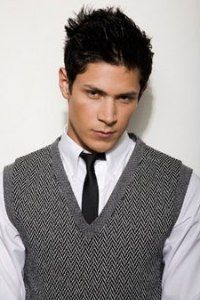
Alex ~ Bvlgari "Pour Homme Soir"

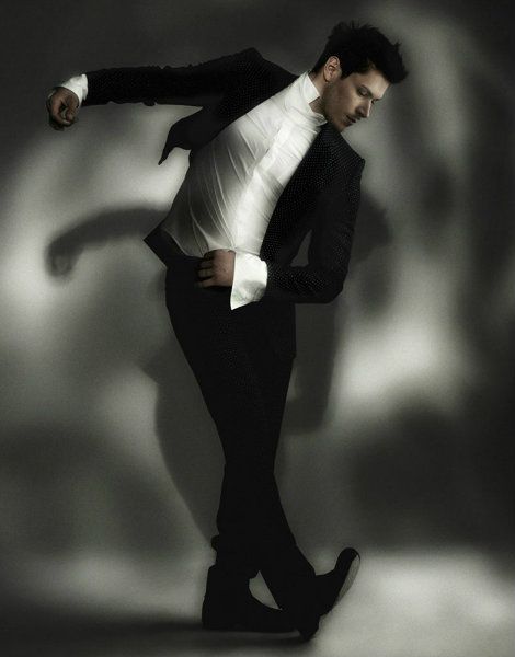
Natalia: Wow, I'm totally love this. I can see this photo to be used as an advertisement for the fragrance. The styling is perfect and I love how gracious your body in this photo. Great job!!! You nailed it!!!
Jared: This is gorgeous. Your suit fits totally with the ads I've seen and then you gave us some action and pizzazz and this is really a top notch photo. Even without my research I loved this and thought it looked like an ad for cologne. Great job!
Andrew ~ Abercrombie & Fitch "Fierce"


Natalia: I love this. I think it's very fierce and I love your eyes connection with the camera. I definitely can see this shot on an advertisement. I love the fact that you try to use different approach for Abercrombie & Fitch Brand. Sexy without being too hoochie!!!
Jared: Andrew, have you always had those biceps?? Yum. Well, this is good, I like your fierce expression and pose. I love that even though they're covered your abs are there because from my research, the bottle shows abs on it. Good job,.
Justin ~ Gap "Core for Men"


Natalia: The words on the right side kinda distracting me because it touch your hand. I like the styling and the concept. But the size and quality once again became your issue, Justin. This photo has so much potential but the execution didn't really work for me
Jared: I can't seem to find a good Core For Men ad but that's ok. I like this because it looks like a cologne ad. Love the muscle bulge as well, yummy. Not a bad job at all.
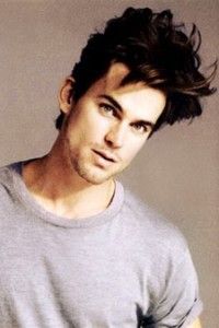
Matt ~ Perry Ellis "Perry Ellis"


Natalia: It's okay. You don't have to include the bottle. I love your explanation because without your explanation this photo is quite safe and boring for me. I think you don't have enough energy here but I love how you relate your photo with the elements of water and wood in your photo. Good job
Jared: A great description can always help and your description is perfect. But I didn't even need it. I've been comparing all the photos to the real ads and you saved me the trouble of having to do that so thank you lol I love your photo. It's gorgeous and natural. Add that with your description and I'm totally sold. Great job!
Nicholas ~ Chanel "Bleu De Chanel"
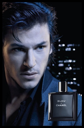

Natalia: Wow!!! This is very striking and cool. I think the original ad is quite boring and they should use your photo immediately for their new campaign. I love the styling. I love how the photo is not too 'blue'. I'm definitely going to buy the product to my bf after saw this ad.
Jared: This is a really good creative photo. I am glad you remembered to include Blue in the photo lol Very nice.
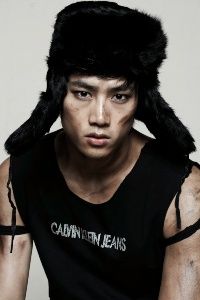
Taecyeon ~ Dunhill "Dunhill Pursuit"


Natalia: The styling is very 'dunhill'. I love your pose in this photo. Really suitable for the 'Pursuit' thing. I wish the background it's not black so you will pop out more. Overall, I still like this.
Jared: The suit works, the hand up is nice, you look good but the background is really blah for this cologne. Not bad though.
I'm still waiting for Gwen's ranking but I knew how dying you want to see your competitor's photo. So let's start the judging session first and waiting for Gwen to update her critique and ranking.
Alex ~ Bvlgari "Pour Homme Soir"


Natalia: Wow, I'm totally love this. I can see this photo to be used as an advertisement for the fragrance. The styling is perfect and I love how gracious your body in this photo. Great job!!! You nailed it!!!
Jared: This is gorgeous. Your suit fits totally with the ads I've seen and then you gave us some action and pizzazz and this is really a top notch photo. Even without my research I loved this and thought it looked like an ad for cologne. Great job!
Andrew ~ Abercrombie & Fitch "Fierce"


Natalia: I love this. I think it's very fierce and I love your eyes connection with the camera. I definitely can see this shot on an advertisement. I love the fact that you try to use different approach for Abercrombie & Fitch Brand. Sexy without being too hoochie!!!
Jared: Andrew, have you always had those biceps?? Yum. Well, this is good, I like your fierce expression and pose. I love that even though they're covered your abs are there because from my research, the bottle shows abs on it. Good job,.
Justin ~ Gap "Core for Men"


Natalia: The words on the right side kinda distracting me because it touch your hand. I like the styling and the concept. But the size and quality once again became your issue, Justin. This photo has so much potential but the execution didn't really work for me
Jared: I can't seem to find a good Core For Men ad but that's ok. I like this because it looks like a cologne ad. Love the muscle bulge as well, yummy. Not a bad job at all.
Matt ~ Perry Ellis "Perry Ellis"


Natalia: It's okay. You don't have to include the bottle. I love your explanation because without your explanation this photo is quite safe and boring for me. I think you don't have enough energy here but I love how you relate your photo with the elements of water and wood in your photo. Good job
Jared: A great description can always help and your description is perfect. But I didn't even need it. I've been comparing all the photos to the real ads and you saved me the trouble of having to do that so thank you lol I love your photo. It's gorgeous and natural. Add that with your description and I'm totally sold. Great job!
Nicholas ~ Chanel "Bleu De Chanel"


Natalia: Wow!!! This is very striking and cool. I think the original ad is quite boring and they should use your photo immediately for their new campaign. I love the styling. I love how the photo is not too 'blue'. I'm definitely going to buy the product to my bf after saw this ad.
Jared: This is a really good creative photo. I am glad you remembered to include Blue in the photo lol Very nice.
Taecyeon ~ Dunhill "Dunhill Pursuit"


Natalia: The styling is very 'dunhill'. I love your pose in this photo. Really suitable for the 'Pursuit' thing. I wish the background it's not black so you will pop out more. Overall, I still like this.
Jared: The suit works, the hand up is nice, you look good but the background is really blah for this cologne. Not bad though.

 , but I vote for Taecyeon to stay.
