Post by Natalia Vodianova on Nov 22, 2012 21:42:57 GMT -5
Hello Models!!!
I'm sorry. I have some issues with my computer and I forgot to leave my ranking so the other judges can continue doing the elimination but I'm here now!!!
This week, you need to submit TWO photos. One for the Inside and the other one is for Outside.
Let's start the judging,
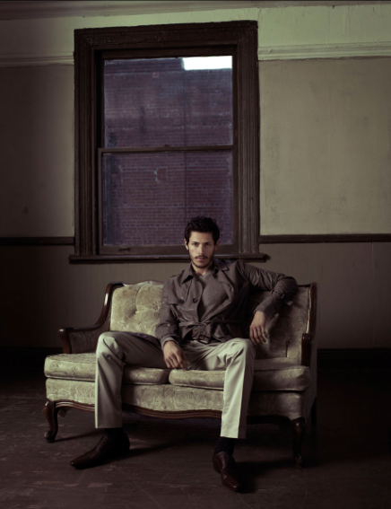
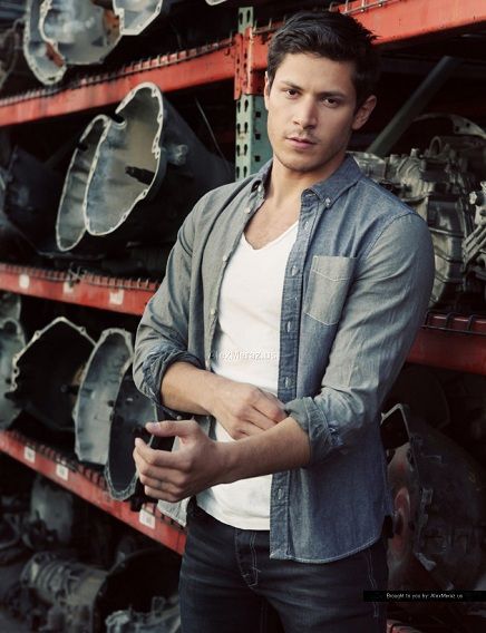
Natalia: For the inside photo, I felt it's a little bit empty. You do look great but it's not really memorable for me. I like the outside one better. The style is so simple but still stylish enough for me. My only issue is I'm not convinced enough by your outside setting. Overall, I'm a little bit torn this week
Jared: I liked the versatility between your two photos. I love your look in the second one. The first one is different and shocking to the Alex we've come to know. I'm not sold completely that you're outside in the outside one. Only because you look like you're in an auto shop, but they have openings lol I dont' know. Good job overall though.
Gwen: The inside photo is definitely different than what we normally see from you. There's a bit of a negative space issue for me and that part probably could have been cropped down a bit without losing any effect in the photo. However, I do like your styling and pose in the picture itself. You look very different with a beard. I like that we can see you better in the Outdoor picture, but the setting isn't established enough for me to 100% believe that you are outdoors. For all we know, you could be in a garage. However, you look very natural in the shot, so that a plus.


Natalia: I love how the photo relates to each other. For your inside photo, I don't really see a model. I see a cute and good looking guy but model? Not really. Outside one is a little bit better. The setting is great and I can see you try to model there. I still think you can do better than this
Jared: I'm not loving your first one. I think you look like a deer caught in the headlights. But I love your second one, and I like how they connect as you said. You've done a good job.
Gwen: There's something oddly intriguing about the indoor photo, but like the other judges, I definitely like the outdoor photo more. I agree that the photos do play into each other well as I can see this as being the same character at different points in a story, so I do like how the pictures compliment each other.


Natalia: I'm not sure with both photos. I don't think either photo is memorable enough. If I have to pick between these two photos, I think the inside one is better. The setting is good but the styling is too formal for me. I've seen you in a suit before. As for you outdoor, I think your expression look so boring and lazy. I don't see the energy from you here
Jared: You have the same expression in both, I'd like to have seen a bit of difference between the two. I like your outdoor one better because of the lighting. The inside, your face looks caved in cuz of the beard and the lighting. And the neck beard doesn't look attractive, where with the outdoor, it doesn't bother me with the more natural lighting.
Gwen: These shots are just a little dull for me. The indoor one is definitely the stronger of the two. The "Neck beard" doesn't bother me at all since I like my men with a little scruff. There's also a bit more of a silent strength to your first photo which still makes it a positive photo. I like the styling for your second shot, but the pose is just lacking for me. I don't get much emotion from your face or your posture and it's a bit of a problem.


Natalia: I'm not sure what happened because you were supposed to submit two photos this week. One for the inside and another one is for the outside. I like this photo. The setting is very regal and expensive. You still need to work on your expression. As for the outside, you have until 8pm to submit the photo for the outside
Jared: I love your indoor, and I'm kind of disappointed with your outdoor, because it's going to bring you down in terms of my ranks. The indoor is gorgeous. Your pose and expression are fierce like, "i'm rich get out of my face" I don't like your toes lol But it's a good picture. I do not like the outdoor one though. Well, it's more that it looks rushed and grainy. Grainy doesn't bother me but it just seems like it was an after thought.
Gwen: Your indoor shot is by far the better of the two in this shoot. I love the posing and the styling for this shot and it's interesting. Had this just been an "Either/Or" shoot and that was your only picture, you'd have nothing to worry about. However, when we get to your Outdoor shot, that's where we run into trouble. It looks like a shot someone would use as their profile picture on MySpace. Yes, I know MySpace is a dated reference, but it's not even up to a Facebook profile standard. We'll just have to see if the strength of your Indoor shot is enough to carry you through this round or not.


Natalia: The outside one is definitely my favorite 'Outside' photo so far. Very interesting and sexy. Great setting as well. I love this one. Unfortunately I don't like the inside one. I think it's so cheesy and the frame as a prop is so irrelevant for me. It reminds me of 90's modeling shot.
Jared: My issue here is again, expression. Same expression same hair. I like your indoor one better because your abs look wonderful. Where the outdoor one you look soft and your boobs look like boobs lol I like the setting the best for outdoor, but your indoor was my favourite. Another thing that your outdoor made me realize is that your nipples are freaking far apart lmfao And on the sides of your pecs almost lol In both pics and your siggy hahahah But it was the outdoor one that showcases it the most cuz of the way you're standing.
Gwen: Like many of the other models, your Indoor shot is the stronger of the two, in my opinion. Although, it is a bit too much of the same in both pictures. The styling and posing are better in the first shot, while in the second shot, you almost look like you're waiting for direction from the photographer on what to do next. Both shots do show off your body really well and I have none of the problems Jared has with your body in the second shot. You're a very attractive man.


Natalia: Two different photos and both of them are amazing. I love the contrast between these two photos. I love how quirky is your first photo. The using of props is so interesting. I like the vest. And the outside is just amazing. From the setting to the way you project yourself is really great for me
Jared: Matt, I like these. You gave two completely different pictures. Like Clark Kent & Superman. We have the quirky nerdy office boy and then the hot masucline outdoor boy. I love both of these and I really have nothing negative to say about either. I still have two more guys to see, but so far, this is tops for me.
Gwen: I love both of these photos. You gave us two completely different characters this week and both work. I love that we can also get a sense of story from both shots. The styling in each shot is spot on for the setting and the vibe of each shot. Great job.


Natalia: I love how darker is your inside photo. The styling is really great and you look so modelesque in this photo. Great body language as well. I'm not really a fan of your outside photo as I find it too stiff but the setting is quite interesting
Jared: You look like Leonardo in your indoor photo. I like the dark and the light. I love your outdoor setting. The best of the bunch for settings. my only issue with you is your mouth when you pose. I'm not sure why, but it's minor. You're only the second person so far to impress me with two shots in one.
Gwen: I love the first shot and I'm torn about the second. I love the styling and setting of your Indoor shot. I also really like the lighting. It's different and helps make more sense of your arm placement. Your Outdoor shot runs into a small problem because of your facial expression. It makes you look like a dopey kid. I do like the styling and setting of the shoot, but wish your actual modeling itself in the picture had a better connection to what I feel should have been the shot.


Natalia: The inside one is definitely million miles better than your outside one. You look so damn tall in the inside photo. The setting and styling are very memorable. I love the modeling value in this photo. As I mentioned earlier, I'm not a fan of your outside because I find it's too candid and I don't see much energy from you here.
Jared: Two more good shots. I'm impressed. The indoor is good, styled nicely and a small smile while waiting on a ride maybe? And then your outdoor, you're lost in though strumming on your guitar. I like these.
Gwen: I love both of these photos. I do agree with Natalia that the Indoor is the stronger of the two, but they're both still really good. Big fan of the styling and overall vibe of the Indoor shot. The Outdoor may not be as memorable, but it's a nice shot, that seems very sweet in the end.
I'm sorry. I have some issues with my computer and I forgot to leave my ranking so the other judges can continue doing the elimination but I'm here now!!!
This week, you need to submit TWO photos. One for the Inside and the other one is for Outside.
Let's start the judging,


Natalia: For the inside photo, I felt it's a little bit empty. You do look great but it's not really memorable for me. I like the outside one better. The style is so simple but still stylish enough for me. My only issue is I'm not convinced enough by your outside setting. Overall, I'm a little bit torn this week
Jared: I liked the versatility between your two photos. I love your look in the second one. The first one is different and shocking to the Alex we've come to know. I'm not sold completely that you're outside in the outside one. Only because you look like you're in an auto shop, but they have openings lol I dont' know. Good job overall though.
Gwen: The inside photo is definitely different than what we normally see from you. There's a bit of a negative space issue for me and that part probably could have been cropped down a bit without losing any effect in the photo. However, I do like your styling and pose in the picture itself. You look very different with a beard. I like that we can see you better in the Outdoor picture, but the setting isn't established enough for me to 100% believe that you are outdoors. For all we know, you could be in a garage. However, you look very natural in the shot, so that a plus.


Natalia: I love how the photo relates to each other. For your inside photo, I don't really see a model. I see a cute and good looking guy but model? Not really. Outside one is a little bit better. The setting is great and I can see you try to model there. I still think you can do better than this
Jared: I'm not loving your first one. I think you look like a deer caught in the headlights. But I love your second one, and I like how they connect as you said. You've done a good job.
Gwen: There's something oddly intriguing about the indoor photo, but like the other judges, I definitely like the outdoor photo more. I agree that the photos do play into each other well as I can see this as being the same character at different points in a story, so I do like how the pictures compliment each other.


Natalia: I'm not sure with both photos. I don't think either photo is memorable enough. If I have to pick between these two photos, I think the inside one is better. The setting is good but the styling is too formal for me. I've seen you in a suit before. As for you outdoor, I think your expression look so boring and lazy. I don't see the energy from you here
Jared: You have the same expression in both, I'd like to have seen a bit of difference between the two. I like your outdoor one better because of the lighting. The inside, your face looks caved in cuz of the beard and the lighting. And the neck beard doesn't look attractive, where with the outdoor, it doesn't bother me with the more natural lighting.
Gwen: These shots are just a little dull for me. The indoor one is definitely the stronger of the two. The "Neck beard" doesn't bother me at all since I like my men with a little scruff. There's also a bit more of a silent strength to your first photo which still makes it a positive photo. I like the styling for your second shot, but the pose is just lacking for me. I don't get much emotion from your face or your posture and it's a bit of a problem.


Natalia: I'm not sure what happened because you were supposed to submit two photos this week. One for the inside and another one is for the outside. I like this photo. The setting is very regal and expensive. You still need to work on your expression. As for the outside, you have until 8pm to submit the photo for the outside
Jared: I love your indoor, and I'm kind of disappointed with your outdoor, because it's going to bring you down in terms of my ranks. The indoor is gorgeous. Your pose and expression are fierce like, "i'm rich get out of my face" I don't like your toes lol But it's a good picture. I do not like the outdoor one though. Well, it's more that it looks rushed and grainy. Grainy doesn't bother me but it just seems like it was an after thought.
Gwen: Your indoor shot is by far the better of the two in this shoot. I love the posing and the styling for this shot and it's interesting. Had this just been an "Either/Or" shoot and that was your only picture, you'd have nothing to worry about. However, when we get to your Outdoor shot, that's where we run into trouble. It looks like a shot someone would use as their profile picture on MySpace. Yes, I know MySpace is a dated reference, but it's not even up to a Facebook profile standard. We'll just have to see if the strength of your Indoor shot is enough to carry you through this round or not.


Natalia: The outside one is definitely my favorite 'Outside' photo so far. Very interesting and sexy. Great setting as well. I love this one. Unfortunately I don't like the inside one. I think it's so cheesy and the frame as a prop is so irrelevant for me. It reminds me of 90's modeling shot.
Jared: My issue here is again, expression. Same expression same hair. I like your indoor one better because your abs look wonderful. Where the outdoor one you look soft and your boobs look like boobs lol I like the setting the best for outdoor, but your indoor was my favourite. Another thing that your outdoor made me realize is that your nipples are freaking far apart lmfao And on the sides of your pecs almost lol In both pics and your siggy hahahah But it was the outdoor one that showcases it the most cuz of the way you're standing.
Gwen: Like many of the other models, your Indoor shot is the stronger of the two, in my opinion. Although, it is a bit too much of the same in both pictures. The styling and posing are better in the first shot, while in the second shot, you almost look like you're waiting for direction from the photographer on what to do next. Both shots do show off your body really well and I have none of the problems Jared has with your body in the second shot. You're a very attractive man.


Natalia: Two different photos and both of them are amazing. I love the contrast between these two photos. I love how quirky is your first photo. The using of props is so interesting. I like the vest. And the outside is just amazing. From the setting to the way you project yourself is really great for me
Jared: Matt, I like these. You gave two completely different pictures. Like Clark Kent & Superman. We have the quirky nerdy office boy and then the hot masucline outdoor boy. I love both of these and I really have nothing negative to say about either. I still have two more guys to see, but so far, this is tops for me.
Gwen: I love both of these photos. You gave us two completely different characters this week and both work. I love that we can also get a sense of story from both shots. The styling in each shot is spot on for the setting and the vibe of each shot. Great job.


Natalia: I love how darker is your inside photo. The styling is really great and you look so modelesque in this photo. Great body language as well. I'm not really a fan of your outside photo as I find it too stiff but the setting is quite interesting
Jared: You look like Leonardo in your indoor photo. I like the dark and the light. I love your outdoor setting. The best of the bunch for settings. my only issue with you is your mouth when you pose. I'm not sure why, but it's minor. You're only the second person so far to impress me with two shots in one.
Gwen: I love the first shot and I'm torn about the second. I love the styling and setting of your Indoor shot. I also really like the lighting. It's different and helps make more sense of your arm placement. Your Outdoor shot runs into a small problem because of your facial expression. It makes you look like a dopey kid. I do like the styling and setting of the shoot, but wish your actual modeling itself in the picture had a better connection to what I feel should have been the shot.


Natalia: The inside one is definitely million miles better than your outside one. You look so damn tall in the inside photo. The setting and styling are very memorable. I love the modeling value in this photo. As I mentioned earlier, I'm not a fan of your outside because I find it's too candid and I don't see much energy from you here.
Jared: Two more good shots. I'm impressed. The indoor is good, styled nicely and a small smile while waiting on a ride maybe? And then your outdoor, you're lost in though strumming on your guitar. I like these.
Gwen: I love both of these photos. I do agree with Natalia that the Indoor is the stronger of the two, but they're both still really good. Big fan of the styling and overall vibe of the Indoor shot. The Outdoor may not be as memorable, but it's a nice shot, that seems very sweet in the end.

